
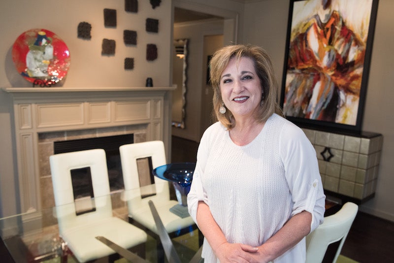
Cathie Groover is not afraid of color.
Her home is proof positive of her fearlessness in experimenting with bright and bold shades in her living spaces.
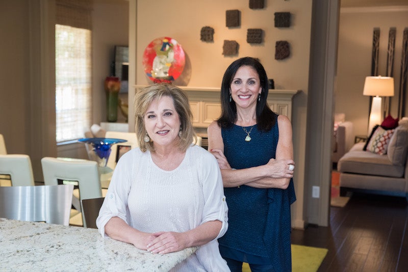
“I do have a color sickness,” Cathie says, with no trace of remorse in her voice. When it came time for Cathie to decorate her home in Hoover’s Chace Lake community several years ago, she enlisted the help of fellow color fanatic and designer Theresa Thornton at Scandinavian Design and Leather Gallery.
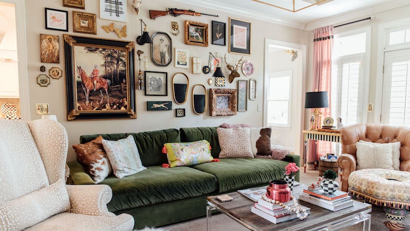
“I think the key in here is the color,” Theresa says. “It’s happy. It’s vibrant.”
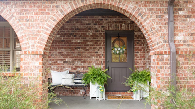
As the second owner of this particular house, Cathie – a Hoover resident for 36 years and a real estate agent for 33 – wanted to put her own touch on the 2,700-square-foot brick home she describes as a modern Tudor cottage that backs up to Chace Lake Park.
“When I first saw it, it reminded me of a cottage,” she says. “I liked it because it has two bedrooms on the main level. The layout of the house works for a lot of different people.”
The home gave her the floorplan she wanted and the space she needed to flex her creative muscle and incorporate color and texture in each room. Theresa says Cathie’s furniture is mostly contemporary, and her accents reflect a conglomeration of different styles.
“I’m not traditional by any means,” she says of her style. “I like a little modern and eclectic. It’s just a fun little house.”
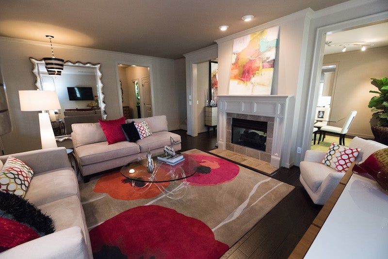
LIVING ROOM
Cathie started with neutral-toned sofas and walls in the living room, and then she had some fun. She chose a rug with bright pink and coral colors set against a beige background – a functional “art piece” in its own right – and then she selected a glass coffee table that allows the rug to be seen through it. “The rug and coffee table were starting points,” Cathie says. The wall art, decorative vases, lamps and throw pillows came later. And Cathie had bought the large mirror that hangs on the wall in the entryway from Theresa 20 years ago.
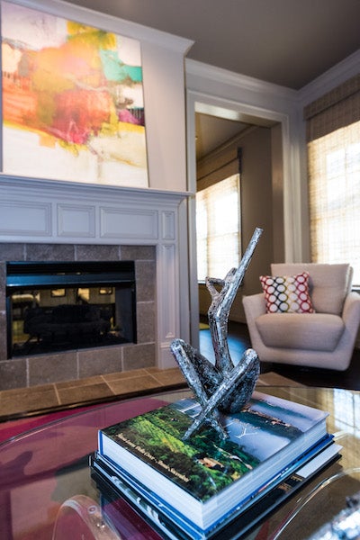
TWO-WAY FIREPLACE
Cathie’s living and dining rooms are separated by a two-way fireplace. This attractive partition of sorts gives the rooms an intimate feel without closing off either space. “I like things to be open and airy,” Cathie says.
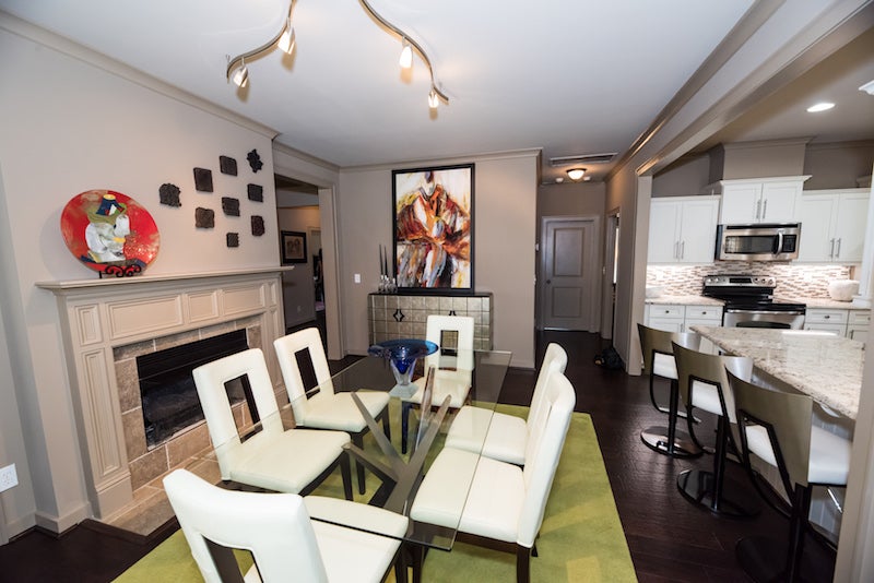
DINING ROOM
Cream and black chairs balance a chartreuse rug underneath the glass table. Track lighting shines down and out, spotlighting artwork over the fireplace and the sideboard, a piece Theresa says she and Cathie spent much time picking out. “We picked every piece very discerningly,” she says.
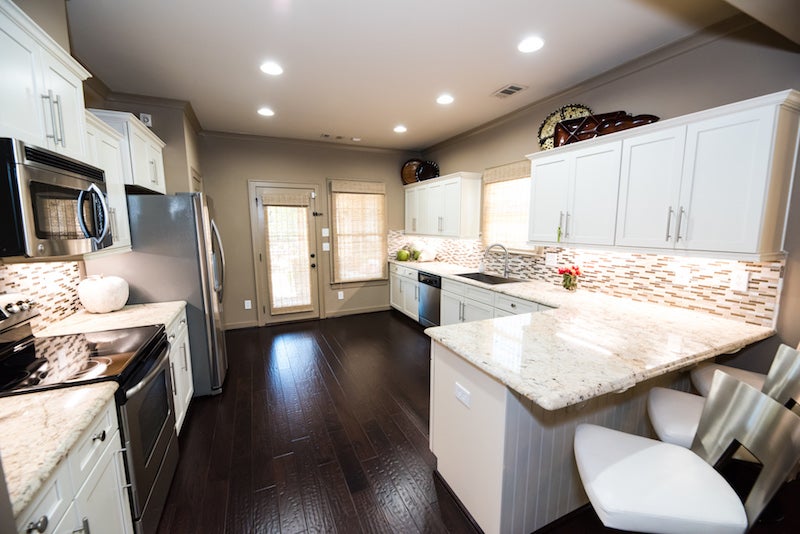
KITCHEN
Cream-colored granite countertops with brown streaks complement the tunneled stone and glass backsplash Cathie chose. Her stainless steel soaking sink matches the appliances and hardware with silver finishes. The brushed silver and white cushion barstools came from Scandinavian Design Gallery.
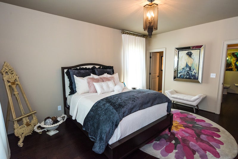
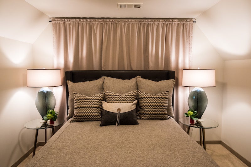
GUEST BEDROOM
This downstairs room surprised Cathie with the way its diverse mix of décor came together so seamlessly in the end. The bed features a luxurious blend of white and navy linens, with two fuzzy, light pink throw pillows Theresa suggested she try. A large circular flower rug bears bold pinks, purples and golds. Cathie was unsure how the chain light fixture would look in this room, but as soon as she hung it, she knew it wasn’t coming down.
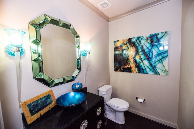
POWDER ROOM
Pinks, greens and splashes of red seem to dominate the downstairs level of Cathie’s home until you step into the powder room, where blue is the showstopper. “Theresa was behind the blue,” Cathie says. A bright blue basin sink coordinates with turquoise-toned wall sconces and a piece of wall art. A multi-faceted mirror reflects the blues, giving the room a bit of an ocean-water ambience.
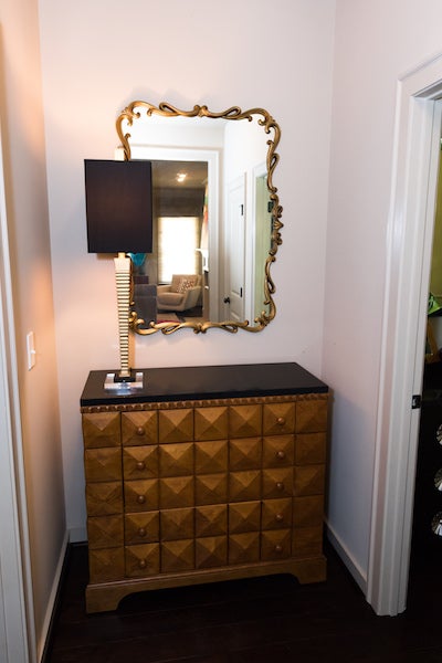
HALLWAY ACCENTS
Cathie has decorated her downstairs hallway with a mirror from her mother’s house, a cabinet from Scandinavian Design and a framed drawing of her sons.
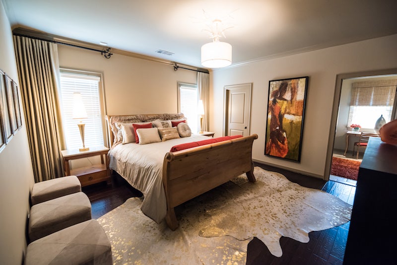
MASTER BEDROOM
As in the other rooms of the house, Cathie wanted to choose one bold color to accent her master bedroom. “I said, ‘I want orange,’” she recalls. She kept her bedspread neutral to allow for the deep orange in the pillows and artwork to stand out. Metallic touches dance across the floor on acid-washed, gold-flecked animal hides.
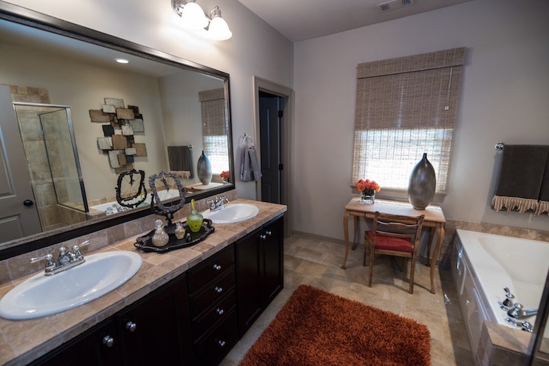
MASTER BATHROOM
The orange accents continue into Cathie’s bathroom, namely in a burnt-orange shag rug spanning the length of the dual vanities. Beige and light-brown tile lines the countertops, floors and shower. Her vanity table came from a shop in Cahaba Heights.
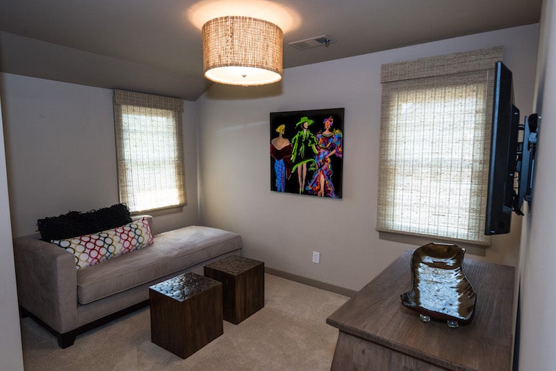
UPSTAIRS SITTING AREA
Although minimally furnished for now, this space could be used for more than just a sitting area, depending on Cathie’s or her guests’ needs. “I just made it a little den,” she says.
UPSTAIRS BEDROOM AND BATHROOM
One of Cathie’s grown sons used this bedroom when he lived with her for a brief period. The bedroom and bathroom complete what Cathie refers to as the guest suite upstairs.
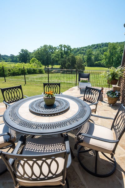
BACK PATIO
Bright oranges, pinks and greens highlight the stone-laden back patio, where Cathie has her choice of cushioned seating in the shade with a TV, or table seating that’s closer to the peaceful backyard overlooking the park.
• • •
BEHIND THE SCENES
Furnishings, Fixtures and Décor: Scandinavian Design Gallery
Interior Design: Theresa Thornton and Cathie Groover


